
Flowchart is a useful UX method that helps designers, project managers, developers and clients. It also saves time and money. It is a top view blueprint of the product, helping organize and structure information and content.
Organizing big complex systems needs precise planning and well-studied information architecture and the best way to do it (for us, for now) is the flowchart. Flowcharts are especially needed on projects with few different roles, pricing plans, connecting more systems, any kind of eCommerce/check out, or a management system. You won’t need the flowchart for a simple presentational site because for them it’s understandable and more productive to do a wireframe, even a simple clickable prototype.
Depending on the project, there are a few cases where the flowchart will help a lot:
- The wireframe is not enough to define and understand all user (roles) flows.
- There is an upgrade on the project and the design system already exists.
- Documentation of the existing product for better tracking and planning
- Information architecture before wireframes for reducing screens and planning templates.
- Uncovering more problems before estimating a project.
To get real for a second, the flowchart is not about having a cool graphical version of your digital product that looks kind of matrix-y. You do it to help everyone on the project understand and define the project purpose and functionalities. So think of it as a -tldr- -do you need me to draw it out for you- graphical documentation- of a product. A top view, per se, of every possible scenario done in the product. Project’s blueprint of all functionalities- I think you got the point.
So, A flowchart by its definition in the world of UX is: graphic documentation of all possible user flows in an app or a product. The way I think it is: a flowchart is a “walk me trough of the user’s possibilities in an app, organized in chunks/templates or elements.”
Why did it become an important part of the discovery phase?
The flowchart we started with was just a waaay upgraded information architecture for the upgrade plan of the site “Litto”. It was a scheme of a plan on how to do the user interface (UI) and all its elements which can be reusable, consistent and easy to moderate depending on the content.
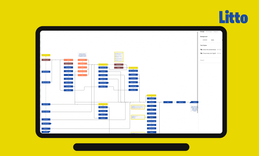
Planning your information like this prevents the design from having different versions of the interface through the app ranging from different elements depending on the version the feature was implemented on, different ratios, buttons or product listing, and so on and on…
Later on, we did flowcharts when too many questions were asked in a wireframe handoff. The requirement was: you (designers) have 10 more hours, write out all the possibilities and properties, filters, sort by… We decided to draw it.
On the project TOMMY apps we needed to do a flowchart for the IRL flows in a moment of the order: how the buyer will order food from an app or a website, how it will connect to the administrator panel, cash register, printing them and preparing the order…. we covered cases of online payment or onsite… I kind of felt like we’re playing retail in the office and it was awesome! Flowcharts are very useful for literally drawing out the possibilities.
Isn’t a flowchart for algorithms and programmers?
Yes, but, no. When you begin to explore (UXplore) the methods and the wonderful UX community you get caught in the contra-productive sphere where every site you are on the UX fellow uses a different name for some kind of a method you learned about (and its original name). So you start researching… and end up googling more and more/getting books from shelves until you are overwhelmed with terminology.
Flowchart-if you google it, you’ll get the algorithm flowchart for programming logic, but if you google “flowchart UX” you will get somewhat the flowchart we do but way simpler.
As time passes by, you understand it’s not important at all because nobody uses it blindly by the book. So how you and your team call it, it’s probably it (the method used: diary studies).
We call it “the flowchart“.
Meet the gang (flowchart symbols)
Oh, the most fun part! Like everything we do, we didn’t follow the book rules of methods but take the basic and sort of-kind of winged it.
To be honest with you, the first flowchart we did (remember Litto?) was an improvised information architecture that had elements like “state” “navigation” “external link” etc. When I was introduced to the magic of a flowchart and how the industry does it, it was way too simple for what’s could do with our improvised flowchart. So, I took the 4 elements and added new ones to help us label everything that can a user do.
So, the main inspiration was actually information architecture, not flowchart… more of a sitemap than a flowchart, but a flowchart is most common in the industry, understandable to developers, and can even communicate different elements, so we decided to use elements of the flowcharts to continue building information architecture (also, looks more badass).
The main symbols
There are 4 main symbols in a flowchart: start or end, decision, manual input and process. With this, you can do 90% of any flowchart. But, (there’s always a butt) we needed more. We needed to label push notifications, pulling data, explanations… it was just not enough.
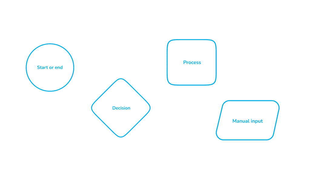
Also, we are not using them by the textbook, we figured out that in the projects, we need to use them more practical. For us, the “Start/end” symbol is the start of the page and the “process” is a static element or a component. In one project there was so many modals that we took the “start end” element and named it “modals”. The developers were immediately on board with it and we agreed on that project the “circle one” will be a symbol for a modal open/end.
Mutant symbols – Locastic
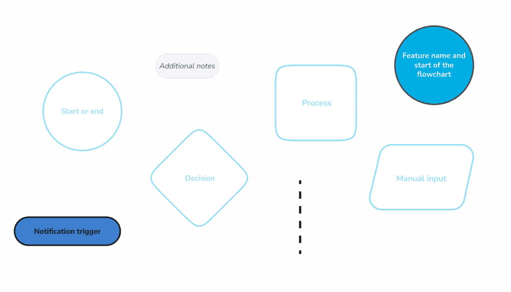
I mentioned that we introduced more symbols? Here comes notification trigger, additional notes, feature name, scroll connection! We also have a new addition to the family “API pull/push“. We added them because in the process of making a flowchart for a certain project we were in a need of new symbol. Btw, clients have the least cognitive load I’ve ever seen and it’s beautiful.
File structure
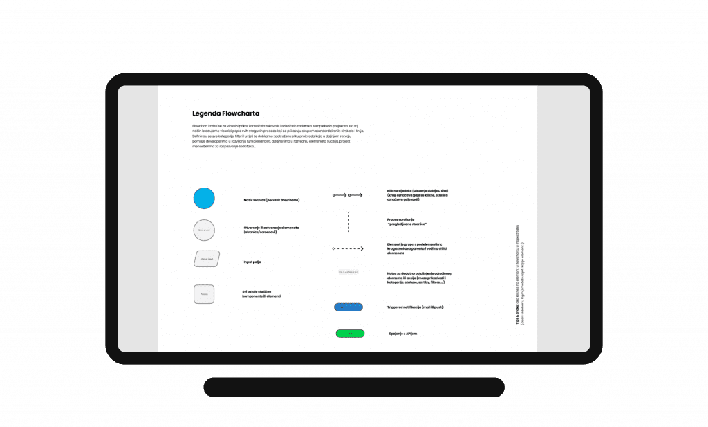
Info – the legend of the flowchart
As I have mentioned above, we sometimes modify the definition of elements depending on the project. That’s why we put out a legend (also we do it for the clients so it’s more presentable). We usually put it underneath the cover page in Figma file like this.
Naming the components
One perfect case study of a user experience was introduced to us by our developers. Let me try to explain the case: In Locastic, we work in Figma. Whatever we can do in Figma we do it because it’s a collaborative tool and helps us and clients to have everything in one place online. We, designers (and Toni) have access to edit files which means we have all options available. When you design, you have an awesome feature where you can create a component and make variants of it which are perfectly displayed in the “Design” panel. You have a dropdown which you can choose from different variants (can be used for buttons-default/small/hover/disabled…).
As a designer with all of these features available, I created a component “Flowchart” and made variants “start/process/action” which I can always see its property when I look at my design panel under variants.
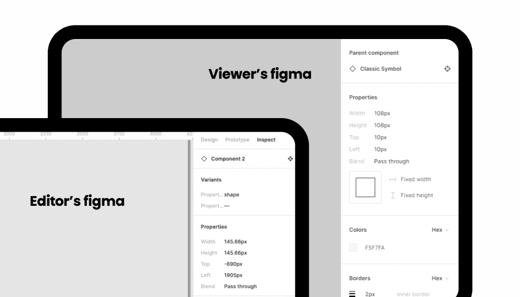
Our developers, they see only inspect panel and I was so confidently telling them if they click on a symbol they can see which element it represents. They couldn’t. They just saw “classic symbol”,”classic symbol” all over the place. UX mistake… Sooo, now – we have different components in a folder of our library (which you can group by naming them – group-name/component-name). It took me about 3 hours to switch them in figma on flowchart but now we won’t ever have that problem. (If I didn’t assume but actually took a look, I would see this problem right away and wouldn’t spend 3 hours on fixing the components). I like them better now and I think view-part-of-the-team does too.
Every flowchart is more organized, more detailed, and more structured than the one before. The point is to present and organize the complete look of the product and communicate any action that is needed. (Did I mention it helps everyone on the team? Yes, oh, okay). More coming up!