As you already know, building a website involves so many decisions and processes; dealing with designers, choosing what stack to use, deciding how to organize your project structure, prioritising features over another, testing everything you did, deploying to a server, and finally optimizing for better speeds and user experiences.
The stack
When we decided to build a new website for our company we had to choose a CMS to make it easily usable for our content creators/marketing team considering this was going to be mainly a content-based blog site the choice was easy and we decided WordPress was the way to go.
To make the most out of modern frontend development and as it is the main frontend framework we use at Locastic, we chose Next.js instead of a classic WordPress frontend theme and hooked it to the WordPress RestAPI.
Considering you are reading this blog one might assume you have already chosen Next.js for your stack and in this article, I’m going to take you on a quick tour of what we did in terms of optimizing this website you are now reading and hopefully help you optimize yours, and how to do it in NextJS.
Table of contents
- Monitoring your performance
- Keep your dependencies up to date
- Reducing bundle size
- Optimising load times
- Optimising images
- Optimising fonts
- Optimising scripts
- Accessibility and best practices
- Other things to consider
- Conclusion
Monitoring your performance
To start monitoring your overall website performance and see the improvement opportunities or potential problems and omissions in your codebase you can use these tools:
Lighthouse
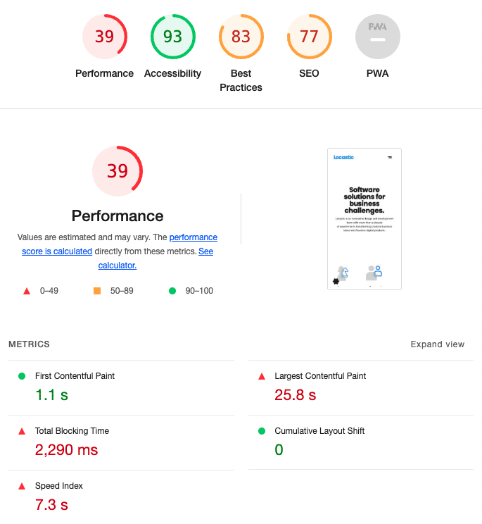
The best way to start monitoring your website and track your progress is naturally using Google Chrome’s Lighthouse tool. To use it simply inspect your site in Chrome, choose Lighthouse under Inspector tabs, and hit Analyze page load. Do it for both mobile and desktop.
If it looks something like this e.g. if performance or any other parameter is under 90 continue reading
Unlighthouse
To check your entire website and compare different pages use Unlighthouse from your CLI.
Keep in mind it will not work on sites that are locked with Vercel or some other tool or if crawling is somehow disabled.
If you have a sitemap uploaded and unlighthouse seems to be loading forever you can use --disable-sitemap flag to let the tool find your pages on its own.
PageSpeed Insights
Enter your URL and hit Analyze. PageSpeed Insights uses Lighthouse under the hood but with a bit more strict settings in terms of connection throttling and the device used for the test.
WebPageTest
Use the WebPageTest to track your loading times with Page Performance Metrics timings, Waterfall View and tips on what could be improved in the Opportunities & Experiments view.
Google Search Console
Any other performance parameter that is not covered by the aforementioned tools should be found in Google Search Console. It offers an overview of different measurements such as:
- Indexing of pages,
- Page Experience based on Core Web Vitals, Mobile Usability, and usage of HTTPS,
- SEO parameters – breadcrumbs, job postings and logos used
Reducing the bundle size
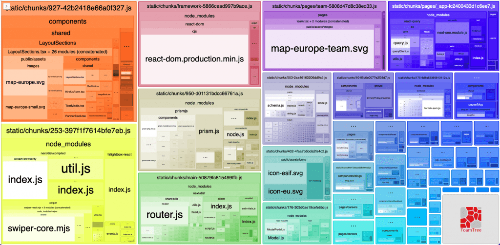
One of the core concepts of optimizing the Next.js application is to reduce the bundle size which is essentially the weight of your application when deployed. To best visualise your app size use the @next/bundle-analyzer tool.
Next Bundle Analyzer
To use it simply install it via npm with
npm install @next/bundle-analyzerAdd the following in your next.config.js:
const withBundleAnalyzer = require('@next/bundle-analyzer')({
		enabled: process.env.ANALYZE === 'true'
	});
and wrap everything in your module.exports with withBundleAnalyzer like this:
module.exports = withBundleAnalyzer({
	/* everything in your module exports */
});
You can now run npm run ANALYZE=true next build or add it in your package.json scripts like this:
"scripts": {
	/* other scripts */,
	"analyze": "ANALYZE=true next build"
},
and run the npm run analyze command instead.
It will open a new browser tab with the details about your bundle and it could look something like this:
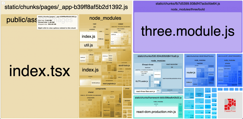
You can see a large chunk which is loaded on every page and decreasing the performance.
Uninstalling unused npm packages
Check your code to see if your installed packages are actually used – you might have installed them at some point and later decided not to use them. Remove all such dependencies.
Keep your dependencies up to date
You should check if there are any dependencies you are using that could be updated as dependencies get updates all the time and they often lose weight in the process.
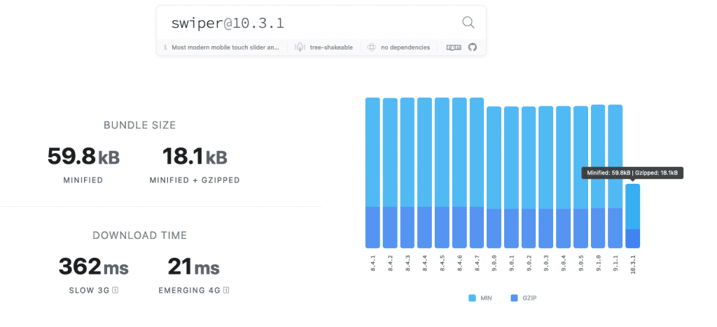
To check the weight of some dependency you can use Bundlephobia. Here is an example of a popular dependency which lost some weight with the last update
To check if there are any dependencies you could update run the npm outdated command and it should give you a list like this:
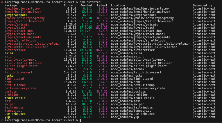
You should be updating your dependencies regularly to keep your project on track but keep in mind that some dependencies are not thoroughly tested and could be prone to all kinds of malicious code so only use the ones that are regularly maintained and updated, have a large download rate, verified license and a big community.
Use sideEffects: false
One significant improvement could be the usage of “sideEffects: false”. Simply add this line to your package.json like this:
"name": "app-name",
"version": "0.1.0",
"sideEffects": false,
"scripts": {
	/*scripts*/
},
/* …dependencies etc… */
This will essentially import only the necessary components for a page when using absolute imports and exporting every component through a single index.js file.
Your bundle should now look something like this:
You can check the details and tradeoffs of using sideEffects: false in this great article.
Organizing your imports
Removing unused imports
You should remove all of the unused imports from your code. Add a lint rule
"rules": {
  …
  "unused-imports/no-unused-imports-ts": "on”,
  …
}
to warn you of all such occurrences or you can use our Locastic linters.
Optimising third party imports
You can use the Import Cost VSCode extension to monitor the weight of each individual import.
Sometimes the automatic importer imports the function from the library such as:
import { isEmpty } from 'lodash';but it should be imported like this to reduce the import size:
import isEmpty from 'lodash/isEmpty';Using dynamic imports
Use dynamic imports for components which are not necessary for SEO and have no UX or SSR value (modals in portals, decorative galleries etc…).
Example:
const GridHelper = dynamic(import('components/common/GridHelper/GridHelper'), {
    ssr: false
});
Components that are dynamically imported should be default exported.
Optimizing your code
Break up your code into separate components if you already haven’t and load them only where needed. Afterwards, you can remove any unused and commented code chunks from your components and pages to reduce the overall bundle weight.
If you are using SVG images in your components or pages you should try to reduce their size, you can easily identify such images with a bundle analyzer, and if you have multiple SVGs with the only difference being their color then use CSS for simpler and JS for more complex color changes. Ditch the excess SVG images.
Optimizing load times
Largest Contentful Paint (LCP)
LCP is the largest above-the-fold element on the screen when the page is loading. In most cases, it is an image but it can also be a text block or any other element.
Do not use any animations for these elements as it will delay the loading of the element while waiting for CSS and JS to load completely thus damaging your performance score.
Parallel fetch
Whenever possible use parallel fetch using await Promise.all() in getServerSideProps while fetching data from the server or servers. This will ensure all requests fire at the same time resulting in improved performance and reduced loading times.
Test if the request is server-side
By default, Next blocks the page navigation while waiting for all the promises in getServerSideProps to resolve even if navigating multiple times between the same pages.
That’s ok if you are doing a hard page reload and you want the server to execute every request in getServerSideProps and return the new HTML.
We are using isServerReq function to unblock the navigation and let the user go to the unresolved page and show them skeletons or cached data if you are using react query.
Example:
export const isServerReq = (req: any) => !req.url.startsWith('/_next');

export const getServerSideProps: GetServerSideProps = async ({
    query,
    req
}) => {
    const queryClient = new QueryClient();

    if (isServerReq(req)) {
        const [careers] = await Promise.all([
            getCareers()
        ]);

        await Promise.all([
            queryClient.prefetchQuery(['careers'], () => {
                return careers;
            })
        ]);

        return {
            props: {
                query,
                dehydratedState: JSON.parse(JSON.stringify(dehydrate(queryClient)))
            }
        };
    } else {
        return {
            props: {
                query,
                dehydratedState: dehydrate(queryClient)
            }
        };
    }
};
Optimising images
This step will bring a big improvement to your performance score as images are often the heaviest loaded asset on the page. The best way to cover most of the image-related performance issues is to use the next/image component provided by Next.js.
Using the next/image
Whenever you can use the <Image> component as it’s already doing some behind-the-scenes optimization for you such as serving the images in next-gen format (WebP) which is a common issue pointed out by Lighthouse. It also comes with a variety of handy props to help you optimize.
Use “sizes” prop
Another issue you might encounter is Properly size images which inform you of images that are not appropriately sized and whose weight you might reduce. To tackle this problem you need the sizes prop with which you tell the browser what image size to use on various devices by specifying different image widths for different device sizes.
Example:
<Image
	src={imageSource}
	alt={imageAlt}
	sizes="(max-width: 767px) 90vw, (max-width: 1179px) 48vw, 570px"
/>
In this example we are loading an image with 90% of viewport width on devices whose screen width is less than 768px, an image with 48% of viewport on devices above 767px and under 1180px (which is our container max-width), and an image with 570px width on sizes above 1179px.
To best determine the widths to use on your image simply inspect the image on different breakpoints in your app and calculate the percentage of the viewport it takes. When the image stops scaling, e.g. after the device width surpasses the container max-width use the fixed image width in pixels.
Use “priority” prop
If your image is positioned above the fold then it is most likely to be the LCP (Largest Contentful Paint) element on the screen and it needs to be loaded as quickly as possible. To do this simply set priority={true} as this will ensure the image is considered a high priority and loads faster.
If your image is shown above the fold on desktop but is below the fold on mobile devices you can set the priority to priority={!isMobile} – isMobile being the boolean media query variable.
You can use the loading prop to achieve the similar but the next documentation states that this can hurt performance and they recommend using the priority property instead.
Try to use the priority prop only on images that really require doing so as using it on every image will result in unnecessary loading of images that the user may never scroll to.
The “quality” prop
If for some reason you need to decrease image file size even more then you can use the quality prop. It takes an integer between 1 and 100 with the default being 75.
Handling the CMS images
One problem we encountered when using WordPress as CMS is how to optimize the images from the Gutenberg editor. Blogs are often full of images and Gutenberg is inserting them as <img> tags which is hurting our performance.
To deal with this problem we used the html-react-parser package with which we can easily replace the <img> with <Image> tag.
Example:
import parse, {
	DOMNode,
	Element,
	HTMLReactParserOptions
} from 'html-react-parser';
import Image from 'next/image';
import React from 'react';

import { IPostView } from 'services/posts/interfaces/IPostView';

export interface IMyComponentProps {
	post: IPostView;
}

export const MyComponent: React.FC<IMyComponentProps> = ({ post }) => {

	const parserOptions: HTMLReactParserOptions = {
		replace: (domNode: DOMNode) => {
			if (domNode instanceof Element && domNode.name === 'img') {
				const { src, alt, sizes, width, height } = domNode.attribs;

				return (
					<Image
						src={src}
						alt={alt}
						sizes={sizes}
						width={Number(width)}
						height={Number(height)}
						className={domNode.attribs.class}
						quality={70}
					/>
				);
			}
		}
	};

	return (
        <div>{parse(post?.content?.rendered, parserOptions)}</div>
    );
};
Optimizing fonts
To optimize font loading you can preload local or Google fonts with next/font but you have to be using next 13 and react 18.
In your _app.tsx add the following:
import localFont from 'next/font/local';
import React from 'react';

const nunitoSans = localFont({
	src: [
		{
			path: '../public/assets/fonts/subset-NunitoSans-Regular.woff2',
			weight: '400',
			style: 'normal',
		},
		{
			path: '../public/assets/fonts/subset-NunitoSans-Bold.woff2',
			weight: '700',
			style: 'normal',
		},
	],
	variable: '--font-nunito',
	fallback: ['Arial', 'sans-serif'],
});

function MyApp({ Component, pageProps }) {
	return (
		<>
			{/* … */}
			<style jsx global>{`
				:root {
					--font-nunito: ${nunitoSans.style.fontFamily};
				}
			`}</style>
			{/* … */}
		</>
	);
}

export default MyApp;
If using CSS/SCSS in your _base.scss add:
body {
	font-family: var(--font-nunito);
}
And if using Tailwind in your tailwind.config.js add:
fontFamily: {
	body: ['var(--font-nunito)', 'Arial', 'sans-serif'],
},
You can read more on this in the next.js documentation.
Optimizing scripts
Third-party scripts can have a big impact on our loading times but thankfully Next has an easy way to deal with that issue with the new experimental worker strategy.
Since it’s an experimental feature it does not yet work with the app directory and should be used with caution.
Worker strategy
Next is using Partytown library to load the script via web workers instead of the main thread, thus greatly improving site loading times.
We had a big clutter on the main thread while loading the google tag manager script using the react-gtm-module. After replacing it with a worker strategy our loading times halved.
To use this simply add the following to your next.config.js:
experimental: {
	nextScriptWorkers: true,
},
install the package from npm:
npm i @builder.io/partytownand add it to your script in _app.tsx:
<Script
	id="gtm"
	strategy="worker"
	dangerouslySetInnerHTML={{
		__html: `
			(function(w,d,s,l,i){
				w[l]=w[l]||[];
				w[l].push({
					'gtm.start': new Date().getTime(),
					event: 'gtm.js'
				});

				var f=d.getElementsByTagName(s)[0], j=d.createElement(s), dl=l!='dataLayer'?'&l='+l:'';

				j.async=true;
				j.src='https://www.googletagmanager.com/gtm.js?id='+i+dl;

				f.parentNode.insertBefore(j,f);
			})

			(window,document,'script','dataLayer','${process.env.NEXT_PUBLIC_GTM_KEY}');
		`,
	}}
/>
if the script you are optimising is indeed the GTM script then you will need to add another code snippet as high as possible in your body
return (
	<Html>
		<Head />

		<body>
			<noscript>
				<iframe
					src={`https://www.googletagmanager.com/ns.html?id=${process.env.NEXT_PUBLIC_GTM_KEY}`}
					height="0"
					width="0"
					style={{ display: 'none', visibility: 'hidden' }}
				></iframe>
			</noscript>

			<Main />
			<NextScript />
		</body>
	</Html>
);
and you should be good to go.
Loading the facebook pixel
If you are using the facebook pixel for simple events such as page view you can load it as image simply by adding this piece of code at the end of your body
<img
  src="https://www.facebook.com/tr?id={yourFacebookPixelId}&ev=PageView&noscript=1"
  alt=""
  width="1"
  height="1"
  style={{ display: 'none' }}
/>
or through an offloaded GTM script.
Accessibility and best practices
These next few points don’t count towards your performance but are useful to know and check to further improve your overall site score.
Html Validator
To test your HTML and ensure its validity you can run your code through the Html Validator tool. It will scan your code and point you to any errors or warnings it encounters such as wrong heading order or usage of <p> tag inside of <h1>.
Colour contrast
When creating a website for a brand you are often limited when it comes to choosing or editing the colours. If you are not-so-limited then you should choose colors based on web content accessibility guidelines (WCAG). Always try to keep your contrasts at a minimum AA level.
Here is a useful tool for checking your contrasts.
Aria labels
All buttons or links without a readable text e.g buttons with image, an icon, or otherwise not readable content should have an aria-label property set to improve the element’s semantics and tell the screen readers what the button is about.
Focused states
Don’t remove browser defaults for button/link focused states, rather style them in a more beautiful way to let your users know where on page they are if using keyboard navigation.
Tabindex
Use Tab index only when necessary as it can lead to problems if not used properly. Tab index can take a value of a negative integer, zero or a positive integer. Try not to use positive integers as it can disrupt the natural order of focusable elements that the user is expecting.
Other things to consider
- If your are using WP as CMS you can use SMUSH plugin for image compression.
- You can try boosting your server hardware.
Conclusion
Your Next.js website has the potential to be exceptional, and you’ve equipped yourself with the tools and knowledge to make it happen. While the road to optimization may be challenging, the destination is worth the effort—a seamless, efficient user experience that sets your website apart.
Embrace these strategies, commit to excellence, and watch your website shine in the digital landscape. Good luck on your journey, and may your site always deliver outstanding user experiences!