Now that CSS Shapes, CSS blend mode, CSS filters and SVG filters have gained widespread support across modern browsers, it’s worth taking a look into the flexibility and functionality they provide to see if they might make sense in your next design project.
The gap between print design and what is possible in graphic editors (photoshop, illustrator and indesign) and web is getting smaller and smaller through the years. In this article I will introduce or remind you about those gap closers.
CSS Shapes
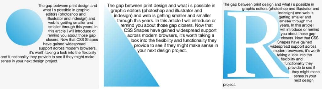
CSS Shapes allow us to make interesting and unique layouts by defining geometric shapes, images, and gradients that text content can flow around.
We can define all sorts of Basic Shapes in CSS by applying the following function values to the shape-outside property:
circle()ellipse()inset()polygon()
In order to apply the shape-outside property to an element, the element must be floated, and have a defined height and width.
<div class="obelisk"></div>
<p>The gap between print...</p>
.obelisk { /* circle */
float: left;
height: 195px;
width: 195px;
shape-outside: circle();
clip-path: circle();
background: linear-gradient(to top right, #00a6e2, #FEFEFE);
}
URLs – CSS shapes
An exciting feature of CSS Shapes is that you don’t always have to explicitly define the shape with a shape function; you can also use an url of a semi-transparent image to define a shape, and the text will automatically flow around it.
Unlike in the other examples, we’re going to use an img tag instead of a div. This time the CSS is simple – just put the url() into the shape-outside property, like you would with background-image.
.penta {
  float: left;
  height: 350px;
  width: 350px;
  shape-outside: url('./star.png')
}
<img src="./pentagon.png" class="penta">
<p>Example text...</p>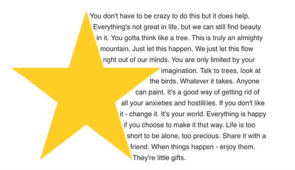
Since the image I used was a star with a transparent background, the text knew which areas were transparent and which were opaque, and aligned itself accordingly.
CSS Blend Mode
You can blend background-images together, or blend them with background-color. It’s as simple as:
.blend-mode {
    background-image: url(blend-this.jpg);
    background-color: purple;
    background-blend-mode: multiply;
}
List of the blend modes: multiply ,screen, overlay, darken, lighten, color-dodge, color-burn, hard-light, soft-light, difference, exclusion, hue, saturation, color, and luminosity. And also normal which resets it.
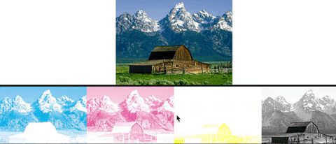
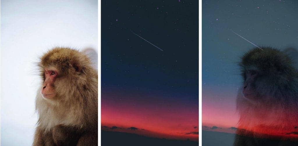
With mix-blend-mode, we define the blending between the element and the element(s) that are behind it. Now let’s see what can be done with the mix-blend-mode property, with the monkey in the foreground and using a soft-light blend mode:
CSS Filters
CSS Filters are a powerful tool that authors can use to achieve varying visual effects (sort of like Photoshop filters for the browser). The CSS filter property provides access to effects such as blur or color shifting on an element’s rendering before the element is displayed. Filters are commonly used to adjust the rendering of an image, a background, or a border.
.filter-me {
    filter: <filter-function> [<filter-function>]* | none
}
List of the blend modes: blur ,brightness, contrast, darken, drop-shadow, grayscale, hue-rotate, invert, opacity, saturate, sepia, url.
Multiple functions can be used, space separated.
.do-more-things {
   filter: blur(30px) grayscale(30%);
}
SVG Filters
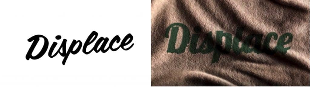
One particular css filter function is url() function which allows us to import even more powerful filter effects from SVG. SVG that’s been around about for about two decades has always had the ability to produce literally photoshop grade effects straight in the browser using code. In fact css filters are actually imported from SVG but they are kinda limited and they can’t do as much as SVG filters can.
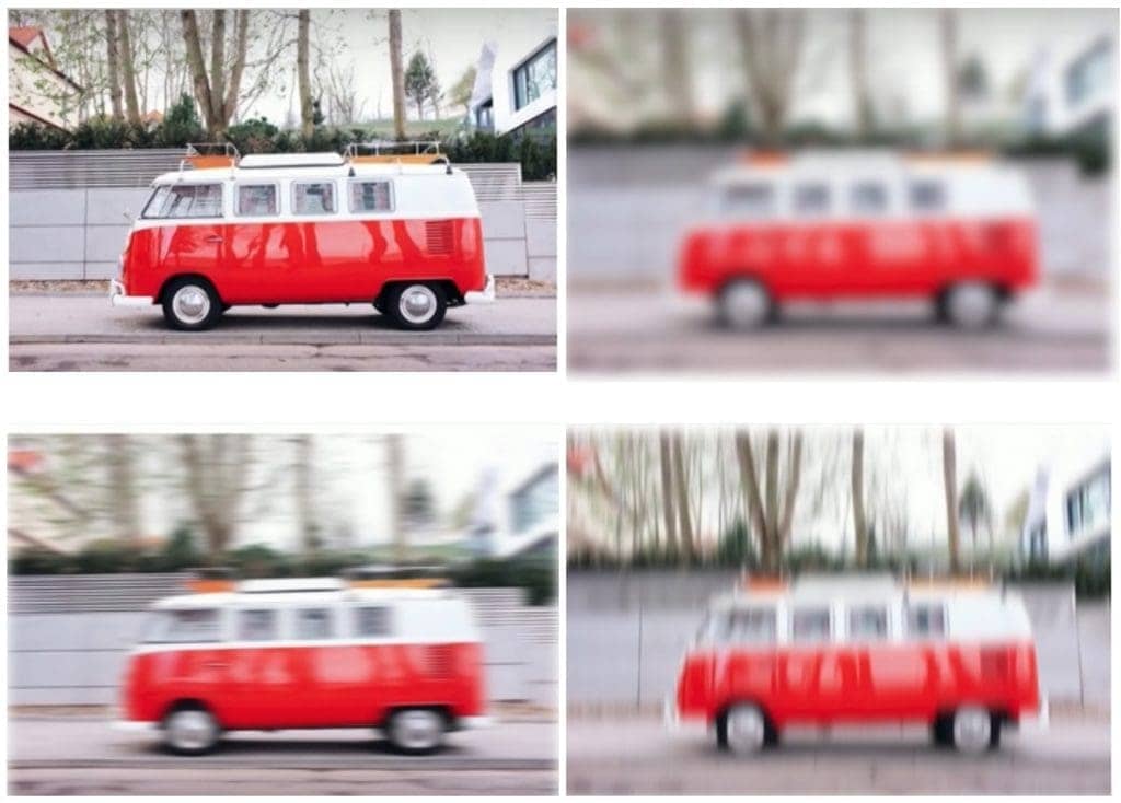
It is currently possible to blur an image in css with blur() function which creates uniform blur effect along the x and y axis applied in both directions on the image. This function is very limited compared to SVG filter functions which allows us to blur image either uniformly, just like with a blur() filter or by applying only one direction blur effect horizontal or vertical which allows us to use motion blur effect and etc..
A <filter> element is never rendered directly; its only usage is as something that can be referenced using the filter attribute in SVG, or the url() function in CSS.
The reasoning for that is that a filter requires a source image to work on, and unless you explicitly define the source image by calling the filter upon that source image, it won’t have anything to render, and so it doesn’t.
A very basic, minimal code sample defining an SVG filter and applying it to a source image in SVG would look like this:
<svg width="696" height="696" viewBox="0 0 696 696">
    <filter id="myFilter">
        <!-- filter effects go in here -->
    </filter>
    <image xlink:href="..."
           width="100%" height="100%" x="0" y="0"
           filter="url(#myFilteredImage)"></image>
</svg>
Each filter element contains a set of filter primitives as its children, all of them are prefixed with “fe” which is short for filter effect. I will not go deep into these, instead I will just name them.
<feBlend> <feColorMatrix> <feComponentTransfer <feComposite <feConvolveMatrix <feDiffuseLighting <feDisplacementMap <feFlood <feGaussianBlur <feImage <feMerge <feMorphology <feOffset <feSpecularLighting <feTile <feTurbulence <feDistantLight <fePointLight <feSpotLight>
SVG filters can be applied to HTML elements as well as SVG elements. An SVG filter effect can be applied to an HTML element in CSS using the url() filter function. For example, if you have a filter effect with an ID “myFilteredImage” defined in your SVG, you can apply that effect to an HTML element or image like this:
.element {
   filter: url(#myFilteredImage);
}
More about SVG filters can be seen in Sara Soueidan courses and articles, she is a front-end web developer and speaker, specialized in semantic markup, CSS, SVG.
Attention: At the time of writing this article, CSS Shapes, CSS Filters and SVG Filters have support in Firefox, Chrome, Safari, and Opera, as well as mobile browsers such as iOS Safari and Chrome for Android. Shapes do not have IE support, and are under consideration for Microsoft Edge.
The new era of web graphics and CSS as a language is looking as radiant as ever. We are closing the gap between the possibilities of image editors and web languages, while at the same time turning a new page in the book of in-browser design.
While you are descending into the trench, develop your wings on your way down and look at things that no one else has bothered to look at. Awaken your creativity.