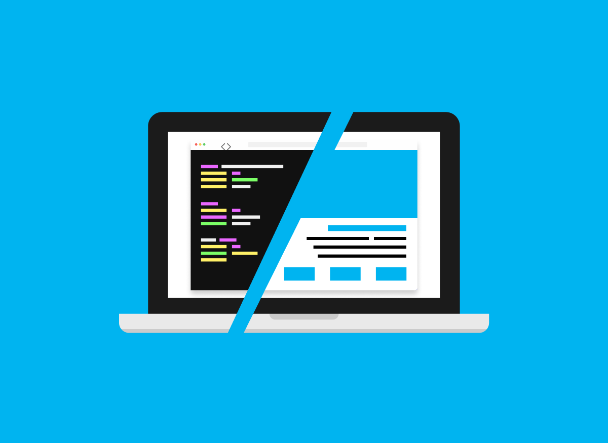
This post is going to be about component libraries. Specifically, I will try to make a case for building your components yourself instead of relying on popular open-source libraries like, for example, the most commonly known Material UI.
But before making that case, I want to outline why ready-made component libraries are often a go-to solution for various developers and teams worldwide.
So let’s start with the most basic and common argument for open-source component libraries:
There is no need to reinvent the wheel.
Low-level components like form elements, buttons, modals, etc., have a lot of details that go into them which are not so obvious at first glance. You have to manage various interaction states, various display variants, and various accessibility concerns. All issues which have been solved countless times by different developers and teams.
By using prebuilt components and not reinventing the wheel yourself, you can focus more of your time and energy on developing features that address concrete business requirements on top of the building blocks you import from somewhere else.
From a business perspective, this is a compelling argument because you seem to be getting much value out of the box and not wasting resources on something otherwise available for free. Still, in reality, everything comes with trade-offs, and nothing is really without a cost. However, seeing so many teams opt into using open-source component libraries makes me think those costs are probably not that obvious.
I’ll try to lay out my understanding and perspective of those trade-offs in the rest of the post, so I can hopefully inform someone else on how to better choose if using pre-made component libraries is the best option for your projects.
The frontend team at Locastic has worked on various projects with different requirements and particularities over the years, and we used a handful of different libraries along the way.
We used Material UI, Chakra UI, Ionic components, Ant Design, NativeBase, and probably some other ones I forgot to mention now.

Sometimes it was the right choice and made sense for the project we were working on, but it often introduced unnecessary hurdles, constraints, and complications.
On a fair number of other projects, on the other hand, we built and maintained our components which required some extra work to set up, but once they were made, it enabled us to move more smoothly as the projects got bigger and more complex. We retained full control over all of the fundamental building blocks of our UI, making it easier to adapt to the ever-changing requirements of a live digital product.
Types of components libraries
The rest of this post will be structured around the idea that any component library can fall into one of the following three categories; open-source, agency-maintained, and branded.
I’ll give my best to describe the benefits and limitations of those different categories.
Open-source component libraries
As mentioned in the introduction, the biggest benefit of ready-made third-party libraries is that they save you time, they take care of the accessibility details that you then don’t have to worry about, they are designed to be generic and extendable so that you can fit them in a wide variety of different possible use cases, and they are usually built by large and specialized teams.
Their biggest drawback, however, is that you rarely want to use them as they come out of the box, you will usually want to modify them, and that is where the problems usually start.
If for whatever reason, branding and design are not that important for your project, then this is not an issue. In that case, choosing a ready-made library and adding your color scheme and typography choices with light style overrides can be great for your project.
If it is not an issue that your project will look and feel generic and “bootstrapy” then just go ahead and build whatever you need on top of them and you will save time and be more productive.
If, on the other hand, you have to try to fit ready-made components into a custom design, the ways open-source component libraries let you modify and extend them will often leave you writing poorly constructed style overrides, configuring their particular style configurations, passing in some sort of style props, or the combination of some or all of the above.
In the best case, you will end up with less-than-great code overriding what you got out of the box. In the worst case, some changes will simply not be possible, and you will have to compromise on the design or the functionality that the product you are building was envisioned to incorporate.
Agency-maintained
Suppose you are working at an agency that develops a bunch of different projects, as we do at Locastic. In that case, if you build your core components, you will be able to reuse a lot of the code between different projects instead of relying on third-party options.
The main benefit of doing it this way is that the code lives in your own codebase instead of being imported from a library which means that you will have full control over all of the details and will be able to make the changes you need by modifying, adding or deleting code instead of overwriting or configuring something from a third party library which results in both cleaner code and higher flexibility.
If you have an issue with a particular component or are you trying to reason why something is set up in the way it is, you will have direct access to people who wrote it and be able to ask them to help you figure it out.
Since certain patterns emerge in every team out of the types of projects your company works on, from the tech stack you are using, and the design patterns your designers use, your agency-maintained set of components will evolve around your particular needs.
For example, at Locastic, we use a combination of Tailwind for most styling use cases and SCSS/BEM for components with complex variants. We use Formik to handle form state, jest, and react testing library to test our components, so the components we share across projects come built around the tech we use and incorporate seamlessly in the rest of our code base.

The key thing when developing these components is to have a sense of what parts are more and what parts are less likely to change from one project to another. We aim to find the best balance of not having to rewrite things that are the same while retaining maximal control to change the things that are different.
Branded component libraries
Once we import our agency-built components from different projects into a new one, they start reshaping themselves around the needs of that particular project and, along with components built specifically for that project, become a branded component library.
Obviously, the styles will adapt to the company’s branding and the design decisions of the particular product you are building.
Still, some functionality can also be different from one project to another.
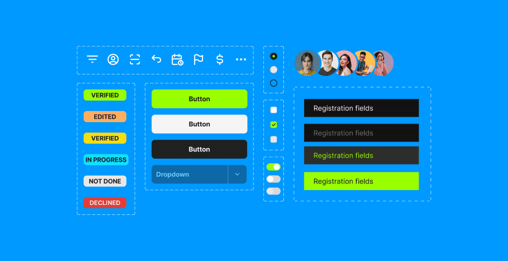
For example, on one project, you might need more complex modal components with multiple sections, some scrollable and some flexible. They might need to have multiple display options and various other kinds of flexibility, while the same modal component on a different project would need to be much more simple, have a header and a body, and always display in the same way.
We want our components to do everything we need them to do and nothing more than that, so we will either cut out unneeded features that add unnecessary bloat or the functionality needed for that particular project.
Branded component libraries evolve more easily over time and adapt to the changes of the project while keeping the code as clean as possible because you are not adding layers of overwrites and configuration over imported abstractions. So, when a need for a redesign comes up a couple of years down the line, and there are a couple of major version updates of all of the open-source libraries, you will be in a much more position to get the redesign implemented and a full app rewrite because of style changes will never need to come up as a consideration.
With time your branded component library becomes a full-fledged design system and becomes a valuable asset instead of devolving into technical debt. A well-made branded component library can be leveraged to provide a high level of velocity when building in new features or even separate products for the same brand, which is even more useful if you are developing those products using a mono repo approach where your component library can be shared in multiple projects from a single source.
To sum it up
To conclude this post, let’s end by switching from a descriptive to a prescriptive mode.
I don’t think you shouldn’t ever use an open-source component library. There are legitimate use cases for them. For example, suppose you are building an MVP proof of concept. In that case, it might make perfect sense to save your time, forget about detailed branding, the imported overhead, code quality, and codebase longevity and just go ahead and build what you need with the tools available for free.
But I would strongly suggest against going for prebuilt third-party libraries by default because of the lack of the know-how around the core web technology, namely HTML and CSS, needed to develop and maintain the components yourself.
Building low-level components like this requires you to be very familiar with CSS to handle different variants and interaction states properly and, if needed, display them differently in different contexts without ending up in specificity hell. It requires you to understand the default HTML prebuilt accessibility to avoid breaking it along the way.
It’s too often these days that new frontend developers skip the fundamentals of which the web is built and start by focusing on frontend frameworks because that is what is written as a requirement in all job postings.
I’ve seen onClick events on buttons that navigate to a different page instead of using links which are crucial for SEO enough times to realize that we have a “skipping the basics” issue in the frontend world.
Not every frontend developer needs to be particularly good at HTML and CSS necessarily, there is nothing inherently wrong with focusing more on the js/framework side of frontend, but the team in your company and the team on your project should have enough people in them who do, so that you don’t need to opt out of owing the code for the core of the UI you are building out of a lack of confidence in your ability to do it properly yourself.