Let’s be real, as a designer, how many times did you find yourself in a situation where the final step of the design process was the first part of the project? Or even as a client, how many times did you step into the land of problems and exceeded your budget because of skipping the important steps in the product design process.
Those or similar experiences are the reason why we need to understand the importance of wireframes and what a big and crucial part of the product design process they really are.
Before designing, some information like User personas, Journey maps, Pain points, etc. should already be collected. This information will help you figure out the layout and possible paths for the user that will lead him through the app or simply make the process (your “afterlife”) so much easier, trust me (but let’s talk about those steps another time.)
At the very beginning of my career, most of the time I was working on user interfaces without having any information. Because the focus was primarily visually oriented (eye candy filled with eye candy) and nothing else mattered.
First questions appeared right after the ship has already sailed…
- I feel like I’m lost, do we need breadcrumbs?
- How do I get to that specific category?
- Can I control the filter like this or this?
- Why is registering stretched through so many steps?
- Why can’t I register with a social network account?
I hope you understand the importance of those questions and the amount of work that stands behind those fixes. The job’s already done, your crew did as you said and now we need to reconstruct the basic parts of the project just to apply your client’s feedback.
Now that we know the problem and the reason why we need wireframes, let’s check out some of the types that exist.
The 3 main types of wireframes
Low, Mid & High-fidelity.
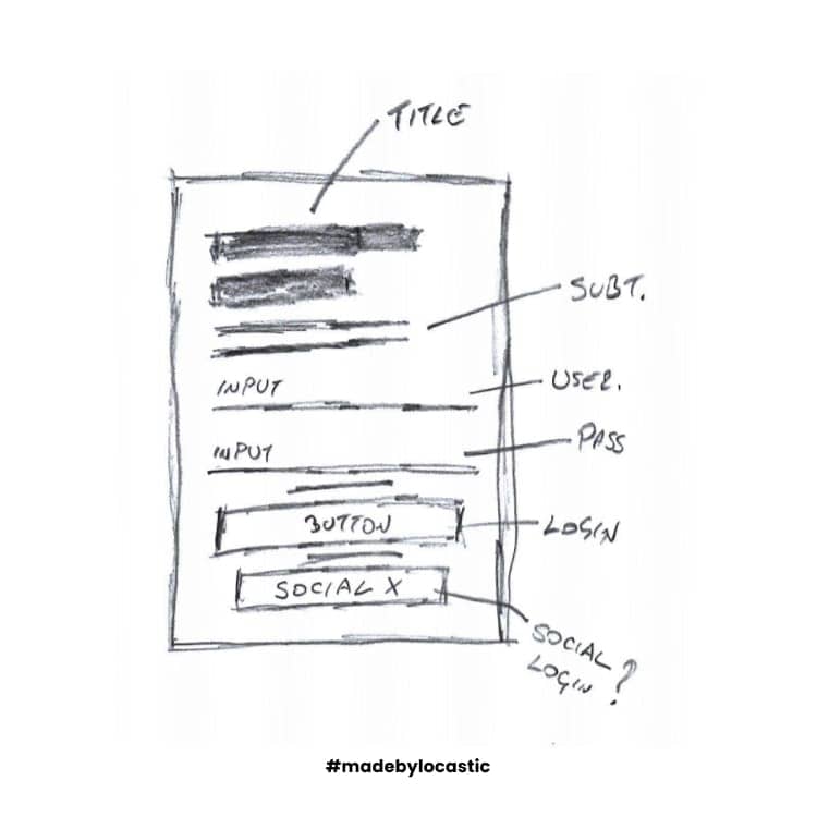
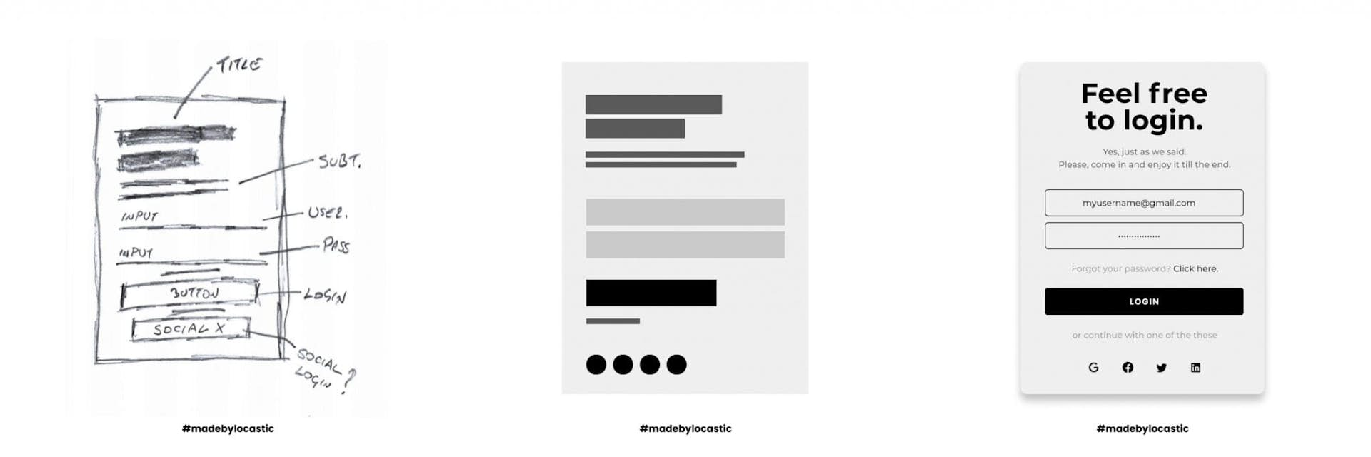
Low-fidelity wireframes are pretty handy as they are the first step into everything. You can easily draw them on a piece of paper, communicate it live with your client while the meeting is going on and just get a feeling and perspective on where the project will be heading.
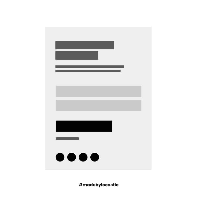
Mid-fidelity wireframes are the most popular ones. They are almost as cheap to make as the low-fidelity ones but have a much more specific way of defining components without getting into images, media in general, and content.
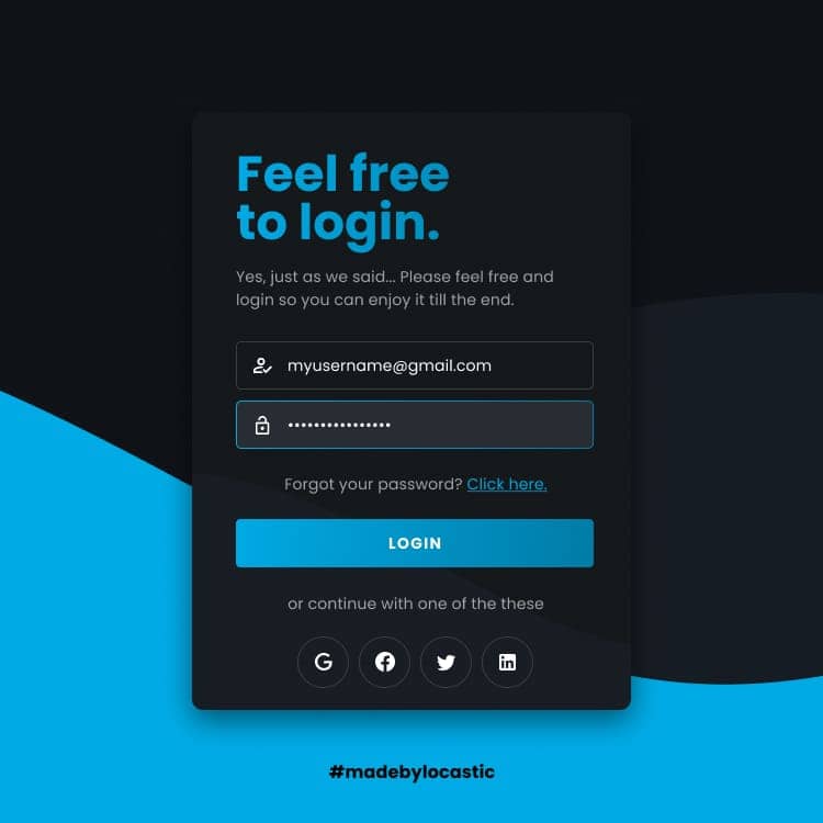
High-fidelity wireframes, oooh yes. Those are the ones that will change everyone’s life while working on the project. Specific defined grids, layouts, content, etc. will bring the grayscale website slowly to life. Imagine clients reading your train of thoughts like a book or just think about a slow clapping “future you” appreciating those great pixel-perfect wireframes?
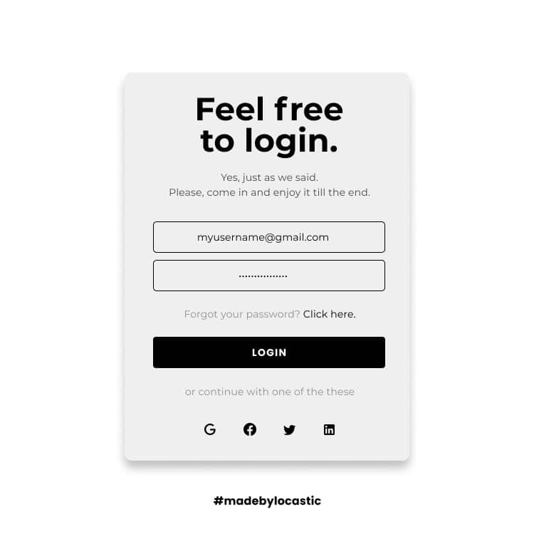
(Side-by-side) low-high fidelity wireframe examples including the result.
Whichever type you pick, you can’t miss. It’s still better than nothing, isn’t it?
Probably the first question in your mind is what tool to use to make it happen.
Just to be clear, there is no “best” tool, so I’m not gonna tell, sell or suggest you one. Use the one you feel the most confident with. If you’re working in Photoshop, use it. Figma? Sketch? Just go for it or at the end of the day, google “best wireframe tools” and pick one of them to work in.
I recommend you start from scratch and learn it the hard way instead of skipping the steps and implementing someone else’s mindset (helped me a lot over the years.)
Conclusion
Wireframes are a great way to define everything. When you think about it, there was a moment in your life where you pulled out a piece of paper and drew some kind of a plan. Exactly that moment was your wireframe moment. You planned your actions for a reason and that is the best instinct that we have.


