Every design can be analyzed and split apart into small pieces, we can always distinguish some distinct UI elements, UX patterns, and design tokens repeatedly used throughout the design. We can find the constraints of its design system in its use of colours, in its use of typography, and so on.
In a way every design has an implicit design system built into it, maybe it’s not intentionally and directly defined and communicated through its design phase, but still, just by itself, it communicates its specific patterns and constraints that give it its identity.
Those patterns and constraints always get interpreted by developers and become the patterns and constraints of the code architecture.
For most smaller projects explicitly defining and documenting the design system may not be necessary. If changes on the project are not frequent in time and are simple to implement it is relatively easy to achieve that everything stays in harmony with everything else already present, both from the design and the code side.
On the other hand, for large projects, which are going to be developed for a long time and evolve as time goes by, as new features get released, and even as designers, developers, and other involved stakeholders change in the meanwhile, it’s easy to lose consistency in the design, lose the tidiness and maintainability of the codebase, and we can even dilute the brand identity and erode the usability of the app or the website for the end users.
Creating a shared language
Frontend developers and designers find themselves in an interesting juxtaposition if they do their job properly, at the surface level the end result of the work of the frontend developer will perfectly mirror the work of the designer, but designers and developers come to the end result of their work through completely different means and often internally perceive the given design in different ways.

For a design system to really be useful in practice in our projects, the designers and front-end developers need to collaborate and invest time in explicitly defining and documenting the design decisions, patterns, and other elements of the design system.

In this post, I want to offer an idea inspired by “shapes” in Typescript, an idea which I think can help us to better communicate and collaborate on projects by establishing a shared language and mental model for the same concepts which exist inside the user interface on both sides of the mirror, both from the design and the code side.
The idea is to define the “shape of the design system”, as a central representation of the whole design system, which is easy to maintain upgrade or modify in any way.
So, I want to teach Typescript to designers?
Not exactly, but for the sake of this post, it wouldn’t hurt if I briefly explained a bit about what typescript is and what do we as developers use it for.
Typescript is a superset of JavaScript which enables developers to be strict about the types of data we are working with.
With typescript we can define that a given component can’t render without us assigning it a title, it has to have a published date in a particular format, and it can, but doesn’t have to, have an attached image.
If we then try to use our component somewhere without giving it a title or break any of the other rules we defined for its data, typescript will warn us and will not let us compile our app until we fix that.
An illustrative way to think about this concept is through an analogy with children’s toys which teaches them about shapes. Kids try to figure out how to pair matching shapes to earn a big nice “Hooray” from their parents once they finally get it right.

The concept of shapes is as simple as that with typescript in our components, if we use the wrong shape of the data for our component, the data just “won’t go through” and the typescript will give us information about what did we do wrong.
Similar advantages we get as developers with typescript can be useful if applied not only for our components but for the whole design system.
When we define shapes, we guarantee consistency in the way our components can be used, we make it possible for multiple developers to easily understand how the component can and should be used by looking at the shape of the data it expects.
When we are expanding the functionality of a component, we usually first start by expanding its shape, in cases when we see the shape is becoming bloated and has too many options, that can give as an early sign that we might need to think about restructuring our code.
Menu bar? Gray bar. Admin bar!
Before we start the development we want to do an interface inventory – we want to take a look at the whole design and make plans on how do we want to divide pages, layouts, and elements, how are we going to name them, and so on.
Frontend developers are crucial in this step because the produced structure will be a blueprint for the architecture of their project, but it’s beneficial that the interface inventories are performed by a diverse group of team members.
The most valuable moments are those in which different perspectives clash.
I’ll paraphrase an example I heard Bred Frost talk about, a designer was thinking he designed the “menu bar”. The project manager always referred to it as the “grey bar”, and in the codebase, the developer has named it “admin bar”.
When we do interface inventories together as a team, that helps us to remove or at least minimize possible misunderstandings which could happen later on in development.
The end deliverable result of performing an interface inventory should be a single document that serves as a source of truth for definitions, naming’s, the hierarchy and categorization of different parts, and the whole structure of our design system.
The following example presents the general idea but can be further developed and modified for specific ways in which other teams work.
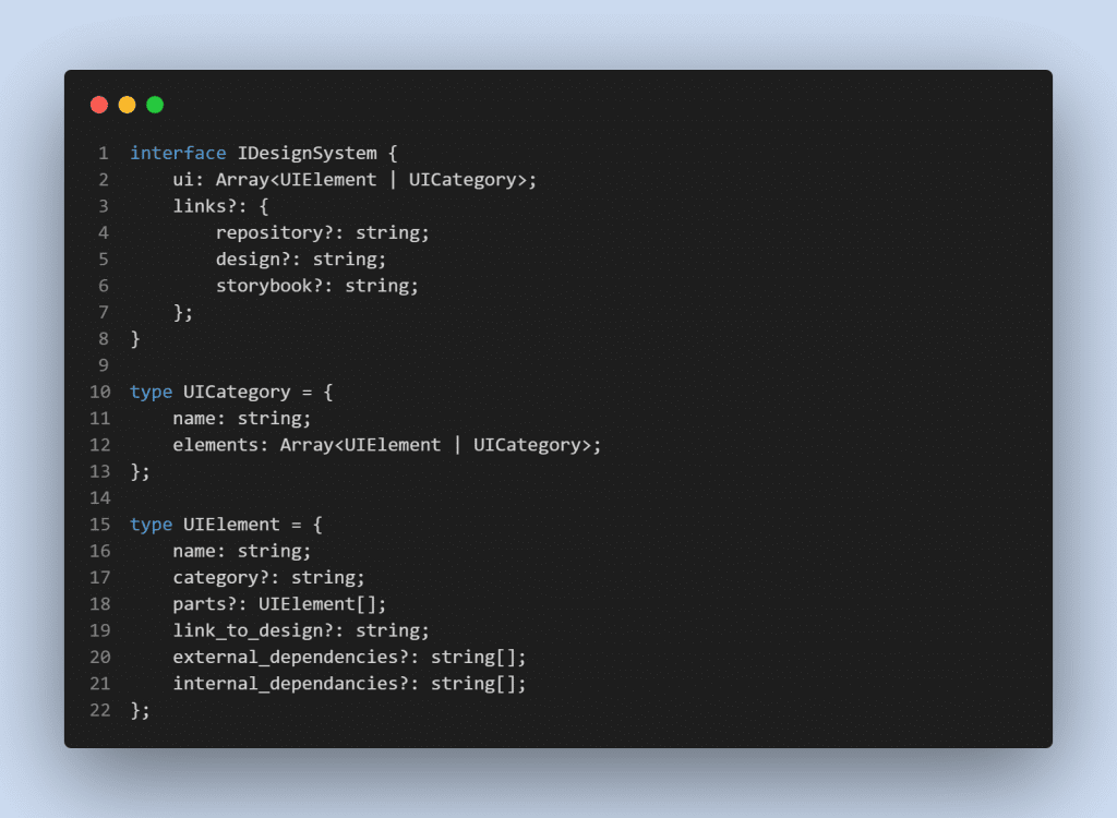
First, let me explain what is happening up there for those who might not be fluent in typescript.
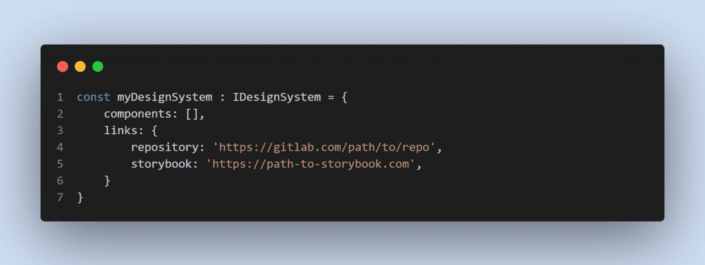
In our JSON definition we describe one UIElement by giving it a name, we can assign a category to it, it can have its smaller parts of which it consists of, and we can link it to the original design and define its internal and external dependencies. The UICategory type helps us recursively define our structure with as many levels of depth as needed.
As potential additional information, we can leave an option to add links to the whole repository/design/storybook, which can be useful later on, but we can just glance over it for the purposes of this post.
The benefits of a JSON definition … are numerous.
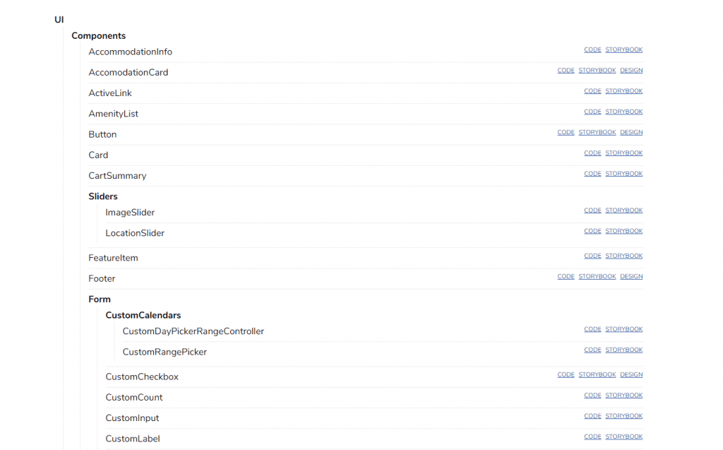
The usual assignment of interface inventory workshops the group gets is to cut the design elements with scissors out of different pages of a website or an application and then organize them into categories. A similar result can be most easily be achieved digitally by an artboard of a design tool instead of physical paper (the ability of real-time collaboration from tools like Figma or Miro are a great help in doing this).
Instead of using scissors and glue, parts of the design can be screenshotted then grouped, named, and assigned on different parts of the artboard based on the collective decisions we come to during the process. If we translate the resulting artboard to a JSON structure, that will open up several interesting possibilities we can get benefits from.
For instance, we can create a script that would use the given JSON and create the whole structure of our project before we even start writing any code ourselves.
With the example structure I provided above we have enough information so that a script could create the files for every component, layout, or page inside proper directories where they should be placed.
Depending on the styling stack used, Sass variables, tailwind configuration, custom CSS properties or anything other which you might you to abstract the theme layer can be extracted from the design token defined in the design system JSON file.
With the same logic, the JSON file can help us develop a programmatic test that would check that our code structure, naming, and even the used design tokens are aligned with what is defined in the file and with that with the whole design system.
By keeping the definition of the design system up-to-date, we force ourselves to see every new change implemented in the context of the whole system. That helps us keep the whole project organized, consistent and maintainable.
If we keep our JSON definition inside the repository alongside the project’s codebase, we can also see how exactly has the system evolved across time by going over its file history.
An Interface inventory is the minimal needed, but crucial step
I would recommend creating an interface inventory for every actively developed project no matter if it’s just starting or it has been around for a while.
If we are talking about an existing project, it would be best to try to forget about the existing naming and structure inside the project and try to document the ideal state towards which we can strive to move closer, instead of documenting what is already there.
Later on in the future when there are new features to implement, changes in the design, or when we need to refactor the structure for whatever reason, we should first apply those changes inside the JSON definition.
Depending on various factors, the time that we will be able to dedicate to maintaining the design system will greatly vary between different projects. Making the interface inventory and keeping the JSON definition up-to-date doesn’t take much time, and by doing nothing else besides it, it can still be beneficial in establishing the shared language and understanding of the design system.
Time to scale?
If our design system would in its implementation be in complete accordance with the JSON definition of the design system, that would mean that all of the used design tokens, components, and all of their variations exist equally separated, categorized, and named both inside the codebase and inside the design source, they are also additionally presented with a tool like storybook and so on depending on how detailed we want to go for that particular project and that particular moment in time.
We may never get to 100% correspondence between the design system, the design source, and the codebase inside the living product, but as long as we have the ideal state defined in a single place, we will have a better perspective from which we can determine how much time to invest in further development and how much time into making the design system more coherent and consistent in order to make future improvements and scaling easier.